Landing pages are one of the leading methods of capturing leads and increasing sales. In some cases, a short and punchy page will do. However, there can be a higher ROI when using a long-form landing page of about 2,000 words. Research shows that long-form landing pages can produce up to 220 percent more leads than short ones when used correctly. Here’s what you need to know about long-form sales landing pages.

The Different Types of Landing Pages
Click-Through
A click-through landing page is the second step in a marketing endeavor that leads a viewer to your long-form sales landing page. First, they clicked your ad, promo, or button because they were interested in your offer. Your click-through page is the appetizer to the main course, the middle-man that lays the foundation for further exploration.
One thing that sets a click-through landing page apart from the others is that it does not have a form requesting information from the user. Its only focus is on convincing the viewer to click through to the next landing page, which is designed to inspire a purchase.
Lead Generation
A lead generation landing page serves the purpose of offering something of value in exchange for your viewers’ information, such as their first and last name, email address, phone number, etc. However, the more information the form asks for, the fewer leads you’ll generate. People are less likely to turn over their personal information, even if your offer is tempting.

An offer that you use to entice users with could be an eBook, an ultimate guide, a checklist, a toolkit, a template, or another free digital download that you’ve created.
Once the viewer has filled out your lead generation form, they’re in your database, where you can further market to them via email drip campaigns and text message correspondence.
Long-Form Sales Letter Landing Pages
Think back to a time when the only way a business could advertise their products to potential buyers was through long-form sales letters crafted from ink and paper.
Without a salesman present to answer questions or sway the conversation in favor of a sale, the copywriters had to think up every question a person might have about the product: what benefits the product provides, the problems it solves, the money you’d save, what sets it apart from the competition, and any other text that moves the reader to become a customer.
Today, we do that digitally with long-form sales letter landing pages, but long-form pages aren’t always the best way to go.
When to Use Them
Your page’s length or the amount of words you need depends on how complex and expensive your product or service is. Use enough verbiage to educate your audience and explain why they should “act now” and make the purchase.
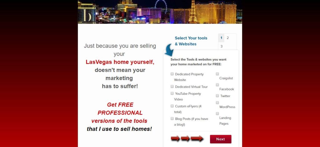
You can also use long-form landing pages when you’re introducing yourself, a complex product, a service to a new audience for the first time, or when you are asking for a commitment such as a subscription, especially if it’s pricey.
And when you use the content on your landing pages to address buyers’ fears and provide solutions to their problems, you can increase your conversion rates by as much as 80 percent.
The How and Why to Target
Your conversions can reach up to 300 percent by correctly targeting your long-form landing pages to the right audience. But what does it mean to target your audience?
First, you’ll need to create a customer persona, which is a snapshot of your ideal client or customer, including their age, gender, location, income, education, hobbies and interests, and other demographic characteristics.
When you demographically target your audience, you’re able to deliver more personalized content that speaks in a way that your readers will understand and see the benefit in.
Your long-form landing pages also lend to your search engine authority when your keyword strategies align your landing pages with your website.
Developing Keyword Strategies
Just like your website and blog posts should be structured around keywords and keyword phrases, so should your long-form landing pages. Your marketing efforts should be synchronized with a combination of common keywords, phrases, and related words known as Latent Semantic Indexing or LSI.

Google knows how to connect your content, so if your website, blog, ads, and landing pages share a coordinated keyword strategy, Google will reward you with higher rankings.
The Main Elements
Keep all of your important information above the fold. You want to hit the key points and the first call to action where users can see what they most need to know without having to scroll down to read further on the page.
Heading
You have a tiny window of just 8 seconds to capture a viewer’s attention on your landing page.
Within about 60 characters, or between 8-12 words, create a headline that tells the viewer what they’ll find when they click your link, but don’t use clickbait. Show the benefit to the user immediately.
For example, if you’re a physical fitness personal trainer trying to convert viewers into long-term clients on an expensive subscription basis, you’d need to hit the key benefits in your headline, such as, “Lose 100 Pounds in 6 Months with a Gentle Personal Trainer.”
Subheading
Subheadings perform best at about 40 characters. If it’s over 42 characters, you’ll divide it into two lines, which isn’t always more effective.
A subheading is another way to catch the viewer’s eye in 40 characters or less to elaborate on the headline. In the case of the personal trainer, the subheading, or tagline, might read, “Fitness and Fun Combined for Your Health.”
Between your heading and your subheading, you’ve implied to your reader that exercise and encouragement can be gentle, and a commitment to health doesn’t have to feel like punishment. It also ensures the viewer that their instructor incorporates fun into the workouts, avoiding the “all work and no play” burnout.
Image
Landing pages perform better when there are images of products in use by the viewers’ peers. For example, in the personal trainer case, the landing page could be enhanced with a picture of a person working out while smiling with the trainer nearby.
You could also opt to use images of company owners or employees, allowing your viewers to relate to you on a deeper level with a personal connection.

Video
On average, around 30 percent of the top-performing landing pages include videos, usually of the product in use, or of someone clearly outlining and briefly explaining an overview of the product’s features and benefits.
Introductory copy
Your introductory copy is your one chance to use a few short paragraphs of text or bullet points explaining the best features, the problems your product solves, and why your viewer needs to click “buy now” without scrolling further. This “above the fold” content is designed to capture those viewers who are interested in buying, wanted to know a tad bit more before making the decision, and have no intention of reading or skimming the rest of your landing page. They’re primed to buy.
Imagine that this reader is searching for something important that they need, but they’re in a hurry and are after a fast solution. Give them what they’re looking for right there on the top of the page.
First call to action
Also above the fold, below your introductory text, is your first call to action, or CTA. This CTA is also designed to be above the fold, where it encourages viewers to take immediate action without reading more.
Testimonials
The next segment is for social proof and trust signals published below the fold, where you include testimonials and written reviews left by previous customers and clients. If you can put pictures and faces next to those testimonials and reviews, it’d be helpful.
Description of the product or service
The next set of content is designed to fully describe every detail of your product, who created it, why they created it, and how it functions. Imagine that you’re talking to someone for the first time who has never heard of what you’re offering. This is your opportunity to introduce yourself and your product or service in vivid detail. Get the reader excited!
Benefits of the Product or Service
Now is your chance to point out every benefit of using the product or service and what problems it solves, such as:
- Elegant design
- High quality
- Easy to manage
- Low maintenance
- Most reliable
- Monthly service/consultation
Ratings and Reviews
This is another great place to insert trust signals and social indicators. Share your star ratings, additional testimonials, or consider using video testimonials to up the ante on your landing page’s success.
Second CTA
Your second call to action comes at the bottom. Now include a bold, easy to find, convincing call to action to convert that viewer into a lead or a customer.
Design Your Landing Pages for Mobile Devices
One of the biggest accidental oversights people make when creating long-form landing pages is that they forget to design for mobile. Most web-surfers are viewing content from mobile devices – either smartphones or tablets, more than those who view it on a desktop or laptop computer.
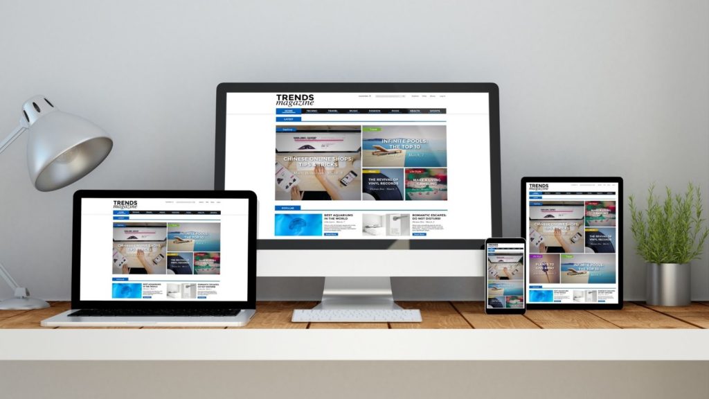
Take the time to view your landing page on several mobile devices before publishing it for the public. Ensure that your pictures don’t overlap your text, that there’s enough white space around your images, and that the paragraph breaks stayed in place.
If you have any kind of pop-up on your landing page, it could completely block the screen on mobile with no way for the user to back out. In that case, they’re likely to close the window and typically don’t return.
Load within 3 Seconds
Three seconds or less – that’s how long it should take for a landing page to fully load on the viewer’s device, whether it’s PC or mobile.
When a web page takes three seconds or more to load, the viewer loses interest, clicks out, and carries on with their original search. Furthermore, they’re not likely to return to your page in the future because they’ve lost trust. You didn’t deliver what they needed.
A fast-loading page satisfies the human need for instant gratification, especially when seeking out important information that will simplify or better their life in some way.
Test and Measure for Results
It would be remarkable if you hit it out of the ballpark on your first swing, right? Home run! But that’s not usually the case with landing pages. They’re more like living documents that get tweaked and modified as they grow to see if they can perform better.
Check in regularly on how your long-form landing page is performing for you. Have you reached the goal you set for your campaign? Could you possibly get even better results?

You’ll know, through analytics, how long people are staying on your landing page, how much they’re reading, scrolling, engaging. You’ll be able to see bounce rates, which indicates that users are rather quickly determining that your content doesn’t match their needs.
You can implement A/B testing, too, which is where you change a single element of a landing page and then re-run it for the same duration of time — first, try changing the heading or subheading.
Next, try swapping out the lead image. Maybe your content could be written a bit more convincingly? Test just one thing at a time. Eventually, you’ll find patterns of what works and what doesn’t, making it easier to create additional long-form sales landing pages in the future.
Conclusion
We’re not so far back in time that we’re writing six-page sales letters to an old-fashioned housewife persuading her to purchase the newest vacuum cleaner on the market. We now have ads and commercials for that. But there are still times when we need to provide more context online than can be shared in a 30-second slot on t.v. or radio. When you have much to express about your product or service and its valuable content, consider drafting a long-form landing page to convert the viewer into a customer.
Choose Your BREW [Ballen Real Estate Websites]